
Disclosure: This article is published by Datamagnet. Vendor and tool claims are self-reported or drawn from public documentation, retrieved 2026-09-17, unless otherwise noted.
How to Build a Cost Dashboard for Multi-Vendor Enrichment Spend
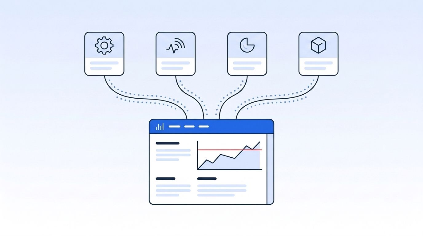
Most GTM teams can name their top data vendor. Almost none can say what they spent on enrichment last month, broken out by vendor and team — not until an invoice lands bigger than budgeted. In 2026, Zylo found organizations waste an average of $19.8 million a year on unused SaaS licenses, with utilization sitting at just 54% (Zylo, 2026 SaaS Management Index). Usage-based enrichment vendors are just as easy to overspend on, since the meter runs on every API call instead of a fixed seat count. This guide walks through building a dashboard that tracks spend across every enrichment vendor you use, so waste shows up in a chart instead of a Q4 budget review.
TL;DR
- In 2026, Zylo found organizations waste an average of $19.8 million a year on unused SaaS licenses, with only 54% of purchased licenses actively used (Zylo, 2026 SaaS Management Index) — usage-based enrichment vendors leak the same way, per credit instead of per seat.
- 56% of organizations increased their consumption-based budget share this year, but only 41% have set up real-time spend controls to match (Gartner, 2026 CMO Spend Survey).
- 85% of SaaS vendors now bill on usage instead of flat seats (Metronome and Greyhound Capital, State of Usage-Based Pricing 2025), so enrichment costs move with every workflow you run.
- B2B contact data decays roughly 2.1% a month — about 22.5% a year — so a record you paid to enrich in January may need re-buying by year end.
- Build one dashboard that pulls usage from every vendor's API, tags spend by team and workflow, and alerts before a budget threshold breaks, instead of a spreadsheet someone updates once a quarter.
What Do You Need Before You Start?
You need a list of every enrichment vendor you pay for, access to each vendor's usage or billing data, and a place to centralize it. Most teams can build a working first version in an afternoon. Here's the checklist:
- A vendor inventory. Every enrichment, intent, or firmographic data tool your team currently pays for, including ones procured outside a central budget.
- Usage or billing access. An API endpoint, CSV export, or admin dashboard for each vendor's credit balance or invoice history.
- A central store. A spreadsheet works for 2-3 vendors; a warehouse table or BI tool (Looker, Metabase, Google Sheets with connected sheets) scales better past that.
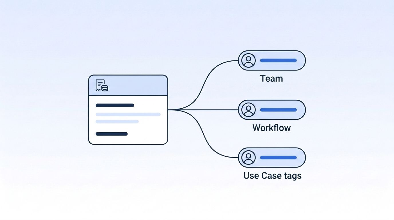
- A tagging taxonomy. At minimum: team, workflow, and use case, so spend maps to a decision-maker, not just a vendor name.
- Time: 2-4 hours for the first build, under an hour a month to maintain once it's wired up.
- Difficulty: Beginner to intermediate — the spreadsheet version needs no data engineering background.
Step 1: How Do You Inventory Every Enrichment Vendor, Contract, and Pricing Model?
By the end of this step, you'll have a single list of every vendor billing you for enrichment, not just the ones finance already tracks. Vendor sprawl usually isn't a mystery — it's just never been written down in one place.
- List every vendor that enriches, verifies, or scores a contact or company record, including tools bought by individual teams outside procurement.
- Record the pricing model for each one: flat seat, credit-based, per-record, or usage-tiered. This determines what "spend" even means for that line item.
- Note contract terms — renewal date, minimum commit, overage rate — since a minimum commit changes how a dashboard should flag waste.
- Compare pricing models against alternatives before renewal. Datamagnet's pay-as-you-go pricing bills per request instead of per seat, which is worth benchmarking against seat-based vendors like the ones compared on the Datamagnet vs. ZoomInfo page.
Verification: You should end up with a spreadsheet where every vendor has a pricing model, a renewal date, and an owner. If a vendor has no owner, that's your first finding — nobody's watching that spend.
Most vendor audits stop at "how much did we pay." That question misses the one that actually drives waste: "what pricing model is this, and does our usage pattern match it?" A seat-based tool sitting mostly idle and a credit-based tool burning through its allotment every week are both waste — they just show up as opposite problems on the same dashboard.
Step 2: How Do You Pull Usage and Billing Data Into One Source of Truth?
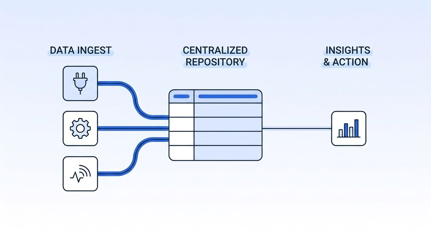
By the end of this step, spend data from every vendor lands in one place automatically, instead of living in five separate admin portals someone has to remember to check. A dashboard built on manual copy-paste stops updating the first time someone gets busy.
- For vendors with a usage API, pull it directly. Datamagnet's Credit Balance endpoint returns your current credit balance on demand, so a script can log it daily instead of someone checking a portal.
- For vendors without a usage API, schedule a recurring CSV export from their billing dashboard into the same central table.
- Normalize every vendor's units into one comparable metric — cost per enriched record — even when the underlying pricing model differs (seat, credit, or per-record).
- Timestamp every pull. A dashboard that shows "current spend" without a last-updated date is a guess, not a source of truth.
For more on pulling structured data out of a vendor API on a schedule instead of a manual export, see how programmatic CRM enrichment applies the same pull-don't-copy-paste principle to record data itself.
Step 3: How Do You Tag Every Spend Line by Team, Workflow, and Use Case?
By the end of this step, every dollar in your dashboard answers "who owns this and why," not just "which vendor sent the invoice." Untagged spend is unmanageable spend — nobody can cut what they can't attribute.
- Tag each usage record by requesting team (sales, marketing, RevOps, recruiting) at the point of ingestion, not after the fact.
- Add a workflow tag: prospecting, CRM enrichment, ABM list-building, candidate sourcing. The same vendor often serves several workflows at wildly different cost-effectiveness.
- Flag any spend with no clear workflow owner as "unattributed" rather than guessing. An unattributed bucket that keeps growing is itself a finding.
This is the same discipline cloud teams already apply to compute spend. In 2026, the FinOps Foundation found 90% of FinOps practitioners now manage or plan to manage SaaS spend, up from 65% the year before, and 98% now manage AI costs, up from 31% two years earlier (FinOps Foundation, State of FinOps 2026 Report). Enrichment spend is following the same path — from an ungoverned line item to something tagged, owned, and reviewed like any other cloud cost.
Citation capsule: Tagging spend by team and workflow at ingestion, rather than reconciling it after the invoice arrives, turns a monthly vendor bill into a set of decisions someone can actually act on — which workflow to cut, which team to rebill, and which vendor to renegotiate before the next contract cycle.
Step 4: Set Budget Thresholds and Real-Time Spend Alerts
By the end of this step, an overspend triggers a notification the same week it happens, not a surprised finance review three months later. A dashboard nobody watches is just a chart; a dashboard wired to alerts is a control.
- Set a monthly budget ceiling per vendor and per workflow, based on the last two to three months of actual usage, not a guess.
- Set a warning threshold at 75-80% of budget so a team has time to react before the hard limit hits.
- Deliver alerts through the channel your team actually checks — Slack or email — using a webhook from any vendor that supports one, so the alert fires the moment usage crosses the line instead of at the next manual check.
In 2026, Gartner found that 41% of organizations have built or are building real-time spend controls for consumption-based tools, and 24% are overhauling systems specifically to curb usage (Gartner, 2026 CMO Spend Survey). That leaves a majority of teams still finding out about an overspend after the fact — exactly the gap a threshold alert closes.
Watching a team discover a credit-based vendor blew through its monthly allotment is a familiar pattern: a new integration started calling the API on every record update instead of once per new record, and nobody noticed until the invoice tripled. A threshold alert at 75% would have caught it three weeks earlier, while the fix was still a five-minute config change instead of a renegotiation.
Step 5: How Do You Build the Cost-Per-Enriched-Record View?
By the end of this step, you can compare vendors on one number — cost per enriched record — instead of comparing unlike pricing models side by side. A $500/month seat plan and a $0.02-per-record credit plan aren't comparable until you normalize both to the same unit.
- Divide each vendor's monthly spend by the number of records it actually enriched, verified, or scored that month.
- Break that number out by workflow, since the same vendor can look cheap for one use case and expensive for another.
- Compare the result across vendors handling similar work — for example, a Company Profile lookup billed per request against a seat-based firmographic tool, the kind of comparison laid out on the Datamagnet vs. Clearbit page.
Isn't it strange that a $0.03-per-record vendor can end up costing more than a $2,000/month flat plan? It happens constantly once volume scales past the break-even point — and you can't catch it without a normalized, per-record view sitting next to every vendor's name.
Step 6: Build Data Decay Into Your Spend Model
By the end of this step, your dashboard accounts for the fact that an enriched record doesn't stay accurate forever, which means the true cost of "current data" is higher than a one-time enrichment fee. B2B contact data decays roughly 2.1% a month — about 22.5% a year — as people change jobs, titles, and companies (HubSpot Database Decay Simulation, citing MarketingSherpa research, retrieved 2026-09-17). A record enriched in January is meaningfully wrong by December if nobody re-checks it.
- Add an "age since last verified" field to your normalized record data, alongside cost per record.
- Model re-enrichment as a recurring cost, not a one-time purchase, when comparing a batch-import vendor against a real-time lookup API.
- Weigh real-time verification against re-buying stale batches — Datamagnet's real-time B2B people enrichment approach queries current data at the moment of use, which changes the "cost per accurate record" math versus a quarterly batch refresh.
Teams that add a decay-adjusted cost column next to raw vendor spend consistently find their "cheapest" vendor isn't actually cheapest once re-enrichment frequency is priced in — a low per-record rate on a batch vendor that needs quarterly re-buys can cost more per accurate record over a year than a higher per-call rate on a real-time source that never goes stale.
What Mistakes Should You Avoid When Building an Enrichment Cost Dashboard?
Most cost dashboards don't fail because nobody built one — they fail because the one they built doesn't match how the vendors actually bill. Here's what trips teams up most often.
1. Comparing raw dollar totals across different pricing models. A $3,000/month seat plan and a $0.04-per-record credit plan aren't comparable until both are normalized to cost per enriched record. Skip that step and every comparison is apples to oranges.
2. Building the dashboard once and never re-pulling live data. A dashboard built from a one-time export is already stale the day it ships. Wire it to a scheduled pull, not a manual refresh someone has to remember.
3. Leaving spend untagged "for now." Untagged spend never gets tagged later — it just accumulates until nobody can explain a third of the budget. Tag at ingestion, every time.
4. Ignoring re-enrichment cost entirely. A vendor comparison that only counts the first enrichment misses the recurring cost of keeping records current. In 2026, Grafana found 29% of teams say infrastructure costs are unpredictable and hard to budget for (Grafana Labs, Observability Survey 2025) — the same unpredictability hits enrichment spend when decay isn't modeled in.
5. Treating the dashboard as a finance-only tool. If the team actually running workflows never sees the dashboard, nobody adjusts behavior. Share it with whoever owns the workflow, not just whoever approves the invoice.
What Does Success Look Like?
If everything went correctly, you now have one dashboard showing every vendor's spend, normalized to cost per enriched record, tagged by team and workflow, with alerts firing before a budget breaks. That's a system, not a spreadsheet someone remembers to check.
- Concrete outcome: Every enrichment vendor has a tagged, normalized cost-per-record figure updated automatically, with no manual export step.
- Key metric: Percentage of spend attributed to a team and workflow (target 90%+ tagged, mirroring the tagging discipline FinOps teams already apply to cloud and SaaS costs).
- Stretch goal: Add a decay-adjusted cost column so vendor comparisons reflect the true cost of staying current, not just the sticker price of a first enrichment.
In 2026, 56% of organizations increased how much of their budget goes to consumption-based tools, but only 41% built the real-time controls to manage that shift (Gartner, 2026 CMO Spend Survey). A cost dashboard is how you land on the right side of that gap. Review Datamagnet's security and data practices before wiring any vendor's API credentials into a shared dashboard, since access scoping matters as much as the numbers themselves. See how a pay-as-you-go pricing model simplifies the per-record math — then build your first normalized comparison this week.
Frequently Asked Questions
What is a multi-vendor enrichment cost dashboard?
It's a single view that pulls usage and billing data from every enrichment vendor you pay for, normalizes it to a comparable unit like cost per enriched record, and tags it by team and workflow. It replaces separate vendor portals and a quarterly finance review with one continuously updated source of truth.
How do you compare vendors when one bills in credits and another bills in seats?
Normalize both to cost per enriched record. Divide a credit-based vendor's monthly spend by records processed, and divide a seat-based vendor's monthly fee by the records that team actually enriched using that seat. The comparable number is cost per record, not the sticker price of the plan.
How often should you review enrichment vendor spend?
Continuously, not quarterly. Usage-based vendors can spike spend within days if a workflow misfires, and Gartner found only 41% of organizations have real-time spend controls in place for consumption-based tools (Gartner, 2026). A dashboard with threshold alerts closes that gap without requiring a daily manual check.
What's the difference between a cost dashboard and a full FinOps practice?
A cost dashboard is one artifact; FinOps is the broader discipline of tagging, forecasting, and governing usage-based spend that produces it. In 2026, 90% of FinOps practitioners already manage or plan to manage SaaS spend this way (FinOps Foundation, State of FinOps 2026 Report) — applying that same discipline to enrichment vendors is a natural extension, not a new framework.
How do you factor data decay into vendor cost comparisons?
Add an "age since verified" field next to your cost-per-record figure, and model re-enrichment as a recurring cost. B2B contact data decays about 2.1% a month, roughly 22.5% a year, so a vendor's true annual cost includes however many re-buys it takes to keep records current, not just the first purchase.
Start Tracking Enrichment Spend Before the Invoice Surprises You
Vendor sprawl in data enrichment isn't going away — usage-based pricing is now standard, and budgets keep shifting toward it. Inventory every vendor, centralize usage data, tag it by team and workflow, normalize it to cost per record, factor in decay, and alert before a threshold breaks. Do that, and the next budget review is a chart you already have, not a surprise you're explaining after the fact.
Sources
- Zylo, 2026 SaaS Management Index, retrieved 2026-09-17, https://zylo.com/blog/how-much-wasted-on-saas-spend
- Gartner, 2026 CMO Spend Survey (via Chief Marketer), retrieved 2026-09-17, https://www.chiefmarketer.com/gartner-cmo-spend-survey-budgets-reflect-increase-in-consumption-based-martech-paid-media-spend/
- Metronome and Greyhound Capital, State of Usage-Based Pricing 2025, retrieved 2026-09-17, https://metronome.com/state-of-usage-based-pricing-2025
- FinOps Foundation, State of FinOps 2026 Report, retrieved 2026-09-17, https://data.finops.org/
- Flexera, 2026 State of the Cloud Report, retrieved 2026-09-17, https://www.flexera.com/blog/finops/flexera-2026-state-of-the-cloud-report-the-convergence-of-cloud-and-value/
- HubSpot, Database Decay Simulation (citing MarketingSherpa), retrieved 2026-09-17, https://www.hubspot.com/database-decay
- Grafana Labs, Observability Survey 2025, retrieved 2026-09-17, https://grafana.com/observability-survey/2025/
- Datamagnet, Credit Balance endpoint, retrieved 2026-09-17, https://docs.datamagnet.co/api-reference/endpoints/credits
- Datamagnet, Webhooks, retrieved 2026-09-17, https://docs.datamagnet.co/api-reference/webhooks
