
Disclosure: Datamagnet publishes this article. Product capabilities described below are based on public documentation, retrieved July 22, 2026.
Building a Data Quality Dashboard: KPIs, Alerts, and Ownership
Most data teams don't find out a pipeline broke - a stakeholder in a QBR does. In 2025, only 26% of Chief Data Officers said they were confident their organization's data could support AI-driven revenue goals, even though 81% now say their data strategy is tied to the tech roadmap, up from 52% in 2023 (IBM Institute for Business Value, IBM Study: Chief Data Officers Redefine Strategies as AI Ambitions Outpace Readiness, November 2025). A data quality dashboard is how you close that gap - you stop hearing about breakage secondhand and start catching it before it ships.
This guide walks through building one from the ground up: which KPIs actually matter, how to architect the checks-to-alerts pipeline behind the dashboard, where to set thresholds so alerts don't get muted, and who should own each metric once it's live.
Key Takeaways
- In 2025, just 26% of CDOs trusted their data for AI-ready decisions, despite rising strategic alignment (IBM, 2025).
- Track six core KPIs: completeness, accuracy, timeliness, uniqueness, validity, and consistency.
- As of 2023, 68% of data teams needed 4+ hours to detect an incident, and business stakeholders spotted issues first 74% of the time (Monte Carlo).
- Assign one named owner per KPI - don't let ownership default to "the data team."
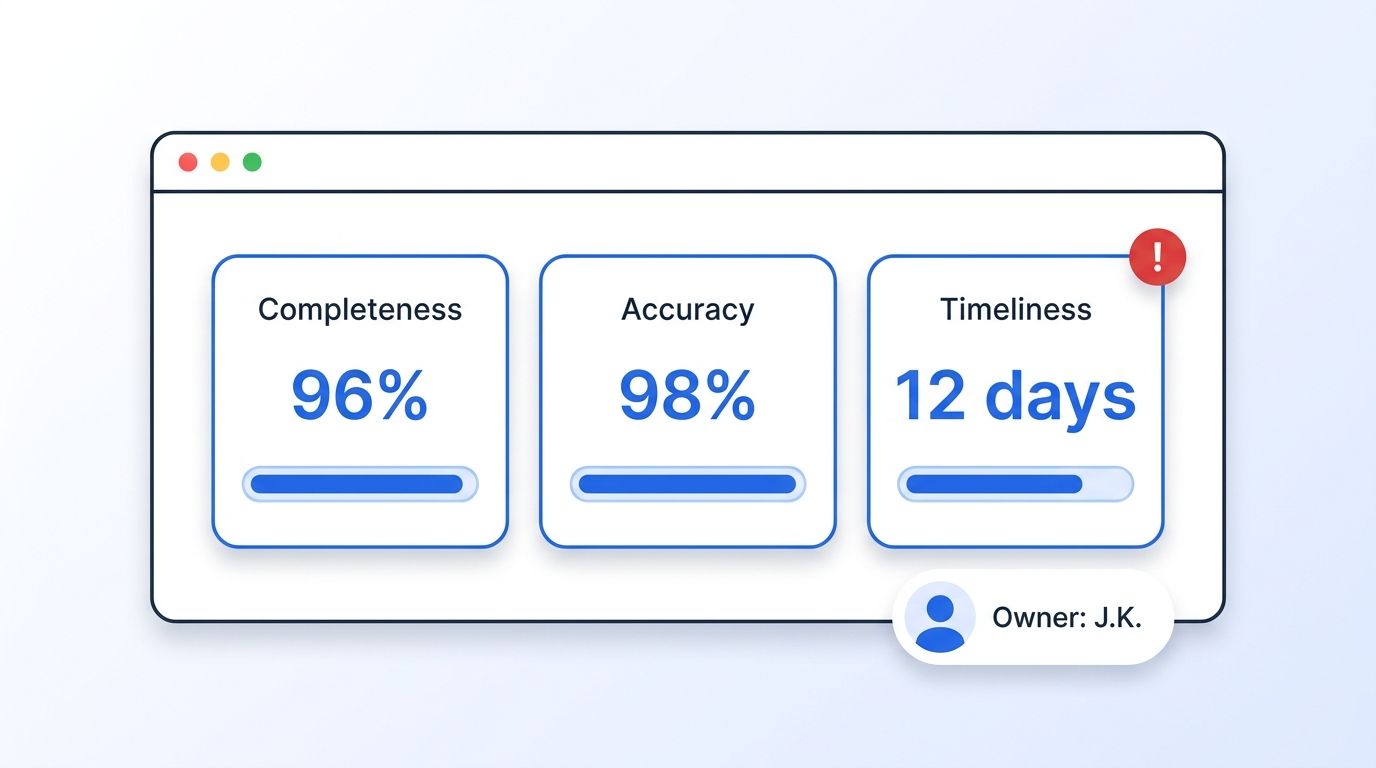
What Is a Data Quality Dashboard?
A data quality dashboard is a single view that tracks the health of your data - measured through specific KPIs like completeness and accuracy - against thresholds, and surfaces alerts the moment a metric breaks. It's different from a BI dashboard: a BI dashboard reports on the business, while a data quality dashboard reports on whether the data feeding those BI reports can be trusted in the first place.
Without one, data quality checks tend to live in scattered notebooks, one-off SQL queries, or a data engineer's memory. That works until the person who remembers the checks goes on vacation, or until a stakeholder finds a broken number before anyone on the data team does.
Citation capsule: A data quality dashboard is a centralized view of KPI health - completeness, accuracy, timeliness, uniqueness, validity, and consistency - checked against thresholds and tied to alerts. It exists to answer one question fast: is this data safe to build a decision on right now, or not?
Great Expectations' 2022 State of Data Quality survey found that 77% of organizations reported data quality issues and 91% said those issues negatively affected company performance (Great Expectations, State of Data Quality, 2022) - a dashboard is the mechanism that catches those issues before they compound.
Which KPIs Should You Track First?
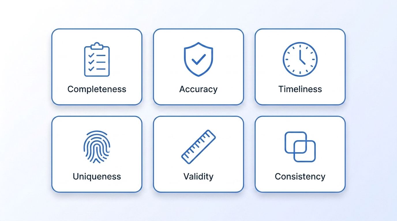
Start with six KPIs, not sixty: completeness, accuracy, timeliness, uniqueness, validity, and consistency. Each one catches a distinct failure mode, and a dashboard that tries to track everything at once just becomes another report nobody checks.
| KPI | What It Measures | Example Formula | Healthy Target |
|---|---|---|---|
| Completeness | % of required fields populated | (Filled fields ÷ Required fields) × 100 | ≥ 95% |
| Accuracy | % of records matching a trusted source | (Verified-correct records ÷ Total records) × 100 | ≥ 98% |
| Timeliness | How current a record is | Days since last verified update | ≤ 30 days |
| Uniqueness | % of records without duplicates | 1 − (Duplicate records ÷ Total records) | ≥ 99% |
| Validity | % of values matching format/business rules | (Rule-passing records ÷ Total records) × 100 | ≥ 97% |
| Consistency | % agreement for the same entity across systems | (Matching cross-system records ÷ Total compared) × 100 | ≥ 95% |
Citation capsule: Six KPIs cover most real-world data breakage: completeness (missing fields), accuracy (wrong values), timeliness (stale records), uniqueness (duplicates), validity (bad formats), and consistency (cross-system mismatches). Pick target thresholds per dataset - a marketing list can tolerate looser timeliness than a live pricing feed.
<!-- [UNIQUE INSIGHT] -->Teams often add a seventh KPI - "coverage," the percentage of source systems actually feeding the dashboard - once they realize the six core metrics are only as good as the pipelines reporting into them. A dashboard that shows 98% accuracy on 40% of your data sources isn't a green dashboard. It's a blind spot with a nice UI.
For B2B teams, timeliness and accuracy usually break down at the source rather than in the warehouse - a company's headcount or a contact's job title goes stale the moment someone changes roles, and no downstream transformation fixes that. Pulling firmographic and people data from a live LinkedIn Company Profile endpoint instead of a quarterly export keeps that specific KPI healthier before it ever reaches your dashboard.
How Do You Architect the Pipeline Behind the Dashboard?
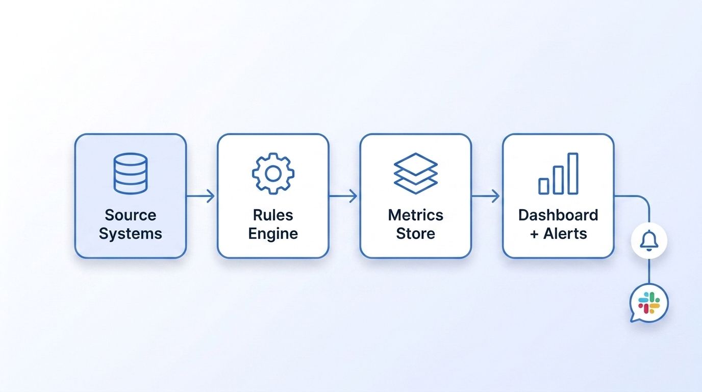
The pipeline behind a data quality dashboard has four layers: source checks, a rules engine, a metrics store, and the dashboard view itself - and building it takes most teams one to two sprints for the first version. This matters because data engineer workloads are already stretched: senior data and technology leaders say engineering workloads are "growing increasingly heavy," and the share of data engineer time spent on AI-related work alone nearly doubled from 19% in 2023 to 37% in 2025, projected to reach 61% by 2027 (MIT Technology Review Insights, sponsored by Snowflake, Redefining data engineering in the age of AI, October 2025). A dashboard that requires manual upkeep won't survive that workload pressure.
Step 1: Define Your Checks as Queries, Not Prose
Each KPI needs a query that returns a number, not a description in a wiki page. Here's a completeness check for a companies table:
-- Completeness check: % of company records with a populated industry field
SELECT
  CURRENT_DATE AS metric_date,
  'companies' AS dataset_name,
  'completeness' AS kpi_name,
  ROUND(100.0 * COUNT(industry) / COUNT(*), 2) AS kpi_value
FROM companies;
What just happened: This query turns a vague concern - "our company data feels incomplete" - into a single number you can track, chart, and alert on daily.
Step 2: Store Results in a Metrics Table
Every check writes one row per run into a shared table, so the dashboard has a consistent schema to query regardless of which KPI or dataset it's showing:
CREATE TABLE data_quality_metrics (
  metric_date DATE NOT NULL,
  dataset_name TEXT NOT NULL,
  kpi_name TEXT NOT NULL,
  kpi_value NUMERIC NOT NULL,
  threshold_warning NUMERIC,
  threshold_critical NUMERIC,
  owner TEXT NOT NULL,
  PRIMARY KEY (metric_date, dataset_name, kpi_name)
);
Watch out: Don't skip the owner column. A metrics table without an owner field is how KPIs end up alerting into a channel nobody's actually responsible for reading.
Step 3: Build the Dashboard as a Query Over That Table
The dashboard itself is usually just a scheduled query plus a charting layer (Looker, Metabase, Grafana, or a custom internal tool) reading the last 30-90 days from data_quality_metrics, grouped by kpi_name and dataset_name. No custom pipeline is needed here - the dashboard is a read-only view on top of the work you already did in Steps 1 and 2.
For teams pulling in B2B contact or company data as a raw material for these checks, the Datamagnet API documentation covers the endpoints and response fields you'd be validating against - useful reference when writing the accuracy and completeness checks in Step 1.
How Do You Set Alert Thresholds Without Causing Alert Fatigue?
Set two thresholds per KPI - warning and critical - and only page a human on critical. This matters because detection speed is already a weak spot industry-wide: as of the March 2023 fielding of Monte Carlo's annual survey, 68% of data teams took 4+ hours to detect a data incident (up from 62% the year before), and average time-to-resolution reached 15 hours per incident, a 166% year-over-year jump (Monte Carlo, fielded by Wakefield Research, The State of Data Quality Survey, 2023). A dashboard with no threshold tuning just adds more noise to an already slow detection loop.
| Metric | Warning Threshold | Critical Threshold | Who Gets Notified |
|---|---|---|---|
| Completeness | Drops below 95% | Drops below 90% | Data steward (async message) |
| Accuracy | Drops below 98% | Drops below 95% | Data owner (Slack) |
| Timeliness | Records >30 days stale | Records >60 days stale | Pipeline on-call (paged) |
| Uniqueness | Duplicate rate >1% | Duplicate rate >3% | Data engineering lead |
| Validity | Rule failures >3% | Rule failures >7% | Source system owner |
Citation capsule: Splitting every KPI into a warning and a critical threshold - and routing only the critical tier to a page - keeps alert volume proportional to actual risk. Warning-tier breaches go to an async channel a steward checks daily; critical-tier breaches interrupt someone immediately, the way an uptime page does.
Registering checks as signals with webhook delivery means the critical tier can trigger automatically the moment a threshold is crossed, instead of waiting for someone to open the dashboard.
Who Should Own Each KPI?
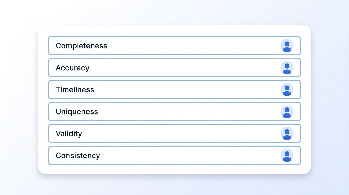
Every KPI needs exactly one named, accountable owner - not a team alias. This is where most dashboards quietly fail: governance operating models are split almost evenly across organizations, with 36% centralized, 36% federated, and 29% hybrid, and 39% of senior data leaders say they struggle to prove the business impact of governance to executives (Board.org, 2025 State of Enterprise Data Governance Report, June 2025). Whichever model you use, the KPI-to-owner mapping has to be explicit, or ownership defaults to "whoever gets pinged last."
| KPI | Owner (Accountable) | Responsible | Consulted |
|---|---|---|---|
| Completeness | Data steward | Data engineering | Business unit lead |
| Accuracy | Domain data owner | Data engineering | Sales/RevOps |
| Timeliness | Pipeline engineer | Data engineering | Data steward |
| Uniqueness | Data engineering lead | Data engineering | Data steward |
| Validity | Source system owner | Data engineering | Data steward |
| Consistency | Data governance lead | Data engineering | All domain owners |
When we've watched dashboards go stale in practice, it's rarely a tooling failure - it's an ownership gap. A completeness KPI sat red for six weeks once because three different people each assumed someone else was watching it. The fix wasn't a better chart. It was writing one name next to the metric.
How Is AI Changing Data Quality Monitoring?
AI is pushing data observability from a nice-to-have into standard infrastructure: 53% of data and analytics leaders had already implemented data observability tools as of a 2025 Gartner survey, with another 43% planning to within 18 months (Gartner, 2025 State of AI-Ready Data Survey, cited in Gartner's February 2026 Market Guide for Data Observability Tools). That shift tracks directly with rising AI workloads on data teams - the same teams now expected to keep pipelines AI-ready.
Isn't it a little backwards that teams are automating AI pipelines faster than they're automating the checks that keep those pipelines trustworthy? The dashboard pattern in this guide - checks, thresholds, ownership - doesn't change with AI in the loop. What changes is the volume of checks running, which is exactly why the metrics-table architecture in Step 2 needs to scale before an anomaly-detection layer gets added on top of it.
Common Dashboard Mistakes to Avoid
Here are the five most common mistakes teams make when they build their first data quality dashboard.
| Problem | Symptom | Fix |
|---|---|---|
| Alert fatigue | Team mutes the Slack channel | Split warning vs. critical, page only on critical |
| No owner assigned | Same broken KPI recurs every month | Assign one named owner per KPI, not a team alias |
| Vanity KPIs | Dashboard is green but stakeholders still distrust the data | Anchor KPIs to a downstream business outcome |
| Checks run too late | Business finds issues before the dashboard does | Move checks upstream, at ingestion, not just in the warehouse |
| No baseline | Can't tell if a metric shift is real drift or normal noise | Track a 30-day rolling baseline, alert on deviation from it |
Across the dashboards we've reviewed with early customers, the "no baseline" mistake was the single most common cause of a false-alarm ticket - teams alerting on any dip below a fixed target instead of a deviation from the metric's own recent trend, which turns normal weekly variance into a recurring fire drill.
Keep the Source Data Clean, Not Just the Dashboard
A dashboard tells you when data quality breaks. It doesn't fix the upstream source feeding it stale or inaccurate company and contact records in the first place. If your completeness or accuracy KPIs keep tripping on firmographic or people data, the fastest fix is often replacing a batch import with a live LinkedIn People Profile endpoint that returns current job titles, headcount, and company details at request time - so the dashboard has less to catch in the first place.
Frequently Asked Questions
What KPIs should a data quality dashboard track?
Start with completeness, accuracy, timeliness, uniqueness, validity, and consistency. These six KPIs cover the most common failure modes - missing fields, wrong values, stale records, duplicates, bad formats, and cross-system mismatches - without overloading a first-version dashboard.
How do you avoid alert fatigue on a data quality dashboard?
Set two thresholds per KPI - warning and critical - and route only critical breaches to a page. As of 2023, average incident resolution time reached 15 hours, a 166% year-over-year increase (Monte Carlo, 2023), and undifferentiated alerts make that worse, not better, by training teams to ignore the channel.
Who should own a data quality dashboard?
Assign one named, accountable owner per KPI - not a shared team inbox. Governance models vary (36% centralized, 36% federated, 29% hybrid, per Board.org, 2025), but the KPI-to-owner mapping needs to be explicit regardless of which model you pick.
What tools can you use to build a data quality dashboard?
Most teams build the first version with SQL checks written into a scheduled job, a metrics table, and an existing BI tool like Looker, Metabase, or Grafana as the visualization layer. A dedicated data observability platform becomes worth adding once check volume outgrows what a scheduled query can handle affordably.
How is AI changing data quality monitoring?
AI is accelerating adoption of dedicated observability tooling: 53% of data and analytics leaders had implemented data observability tools as of a 2025 Gartner survey, with another 43% planning to within 18 months (Gartner, cited in Monte Carlo, 2026). Rising AI workloads on data teams are a direct driver of that shift.
Build the Dashboard, Then Assign the Owners
A data quality dashboard only works if all three pieces are in place: the right six KPIs, thresholds tuned so critical alerts actually get acted on, and one named owner per metric. Skip any one of those and the dashboard becomes either noise nobody trusts or a green screen that hides real problems - the same gap that leaves just 26% of CDOs confident in their data today (IBM, 2025).
Start with the completeness and accuracy checks in Step 1, wire them into the metrics table in Step 2, and assign owners before you turn on a single alert. If the underlying B2B data feeding those checks is the recurring problem, review Datamagnet's LinkedIn Company API for a live alternative to the batch exports that usually cause the drift in the first place.
Sources
- IBM Institute for Business Value (with Oxford Economics), IBM Study: Chief Data Officers Redefine Strategies as AI Ambitions Outpace Readiness, retrieved 2026-07-22, https://www.prnewswire.com/news-releases/ibm-study-chief-data-officers-redefine-strategies-as-ai-ambitions-outpace-readiness-302613794.html
- Monte Carlo (fielded by Wakefield Research), The State of Data Quality Survey, retrieved 2026-07-22, https://montecarlo.ai/blog-data-quality-survey
- Monte Carlo, citing Gartner's 2025 State of AI-Ready Data Survey and February 2026 Market Guide for Data Observability Tools, retrieved 2026-07-22, https://montecarlo.ai/blog-what-2026-gartner-market-guide-for-data-observability-tools-means-for-your-data-and-ai-team-my-take
- Board.org, 2025 State of Enterprise Data Governance Report, retrieved 2026-07-22, https://board.org/data/resources/what-we-learned-from-the-2025-state-of-enterprise-data-governance-report/
- MIT Technology Review Insights, sponsored by Snowflake, Redefining data engineering in the age of AI, retrieved 2026-07-22, https://www.technologyreview.com/2025/10/23/1125651/redefining-data-engineering-in-the-age-of-ai/
- Great Expectations (fielded via Pollfish), State of Data Quality survey, retrieved 2026-07-22, https://www.aidataanalytics.network/data-governance/articles/data-quality-crisis-new-survey-reveals-77-of-organizations-have-quality-issues
- Datamagnet, API Documentation, retrieved 2026-07-22, https://docs.datamagnet.co/api-reference/introduction
- Datamagnet, Webhooks, retrieved 2026-07-22, https://docs.datamagnet.co/api-reference/webhooks
- Datamagnet, Company Profile endpoint, retrieved 2026-07-22, https://docs.datamagnet.co/api-reference/endpoints/company
